Executive Overview
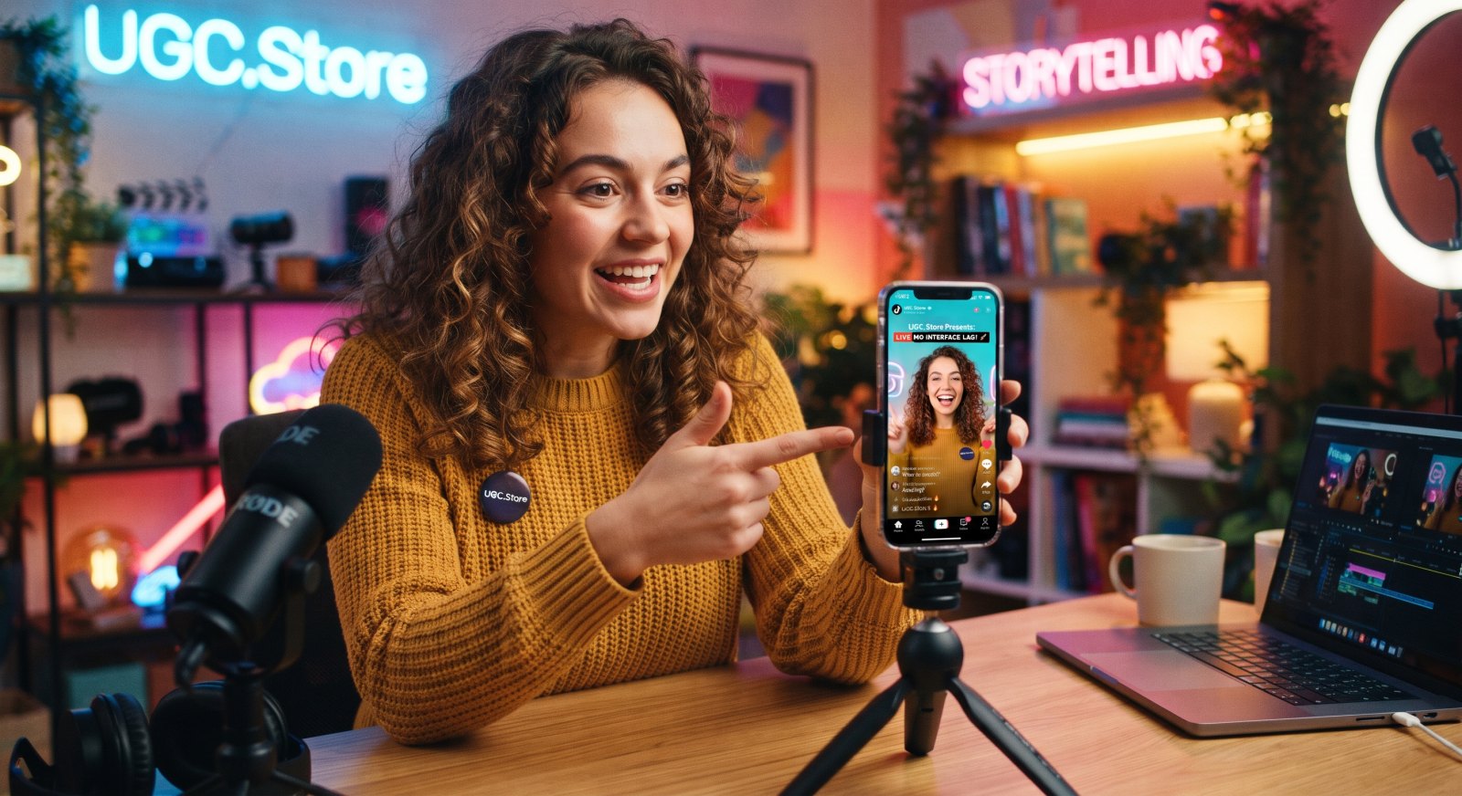
Screencast storytelling in app-focused TikTok UGC fails for a reason that is rarely diagnosed correctly. The assumption is that the problem is technical—bad recording settings, dropped frames, compressed exports—and the solution is better capture. The actual problem is narrative. Interface lag is not a rendering issue. It is a pacing issue disguised as a technical one, and the fix is not higher bitrate. It is script architecture that eliminates dead screen time before the recording ever starts. The data is unambiguous: hands-on app showcases that let viewers see and feel the product experience in real time delivered a 49% boost in install rate and a 28% decrease in CPA compared to talking-head control creative. The screen works. The lag kills it. The script must be built to survive the screen.
Theoretical Basis and Psychology of Mechanics
The psychology of screencast storytelling rests on a principle that app marketers consistently underestimate: the screen is not evidence until the viewer knows what to look for. A raw recording of an interface is a catalog. A recording of an interface that does something the viewer was promised is a demonstration. The gap between the two is the script.
The first mechanism is the attention split problem. Picture-in-picture formats convert because the overlay face supplies social proof and narration while the base layer supplies evidence, and viewers process both simultaneously. But that simultaneity only works if the base layer is moving toward something. A screen that hesitates—a loading spinner, a menu search, a finger hovering over a button—collapses the social proof because the face has nothing to react to and the viewer has nothing to track. Interface lag is not a visual flaw. It is a narrative vacancy, and the viewer fills that vacancy with a swipe.
The second mechanism is TikTok’s compression reality. The platform favors 1080p at 30FPS and automatically compresses uploads, downscaling high-frame-rate footage and introducing stutter that the creator never saw in the original. This means the interface lag the viewer experiences is not always the creator’s fault—but it is always the creator’s problem. The script must be built for the compressed version, not the exported version. Screens with small text, rapid transitions, and subtle animations will collapse into illegibility. The solution is not better export settings. It is designing the demo for the worst-case render: large UI elements, slow deliberate actions, and a single visual focus per beat.
The third mechanism is the still-frame penalty. TikTok’s own guidance explicitly warns that screen recordings with little or no movement reduce engagement and retention, and recommends at least three seconds of dynamic content without still images or looping visuals. A screencast that pauses on a menu, a settings screen, or a confirmation dialogue is functionally a still frame, and the algorithm reads it as low-quality content regardless of the creator’s intent. The script must treat every second of screen time as a motion commitment. If the screen is not visibly changing, the video is dying.
The fourth mechanism is the setup tax. The most common source of interface lag in app UGC is not technical—it is the onboarding and setup sequence that the creator feels obligated to show because it “proves the app is real.” The viewer does not need to see account creation. The viewer needs to see the moment the app does the thing. The script must cut the setup tax entirely or compress it into a single spoken line: “It took two minutes to set up and then—” followed by a hard cut to the result. The viewer’s patience is not a resource to be spent on loading screens.
Step-by-Step Algorithm & Methodology
The framework below sequences a screencast storytelling UGC asset from cold open to install, with each phase engineered to eliminate interface lag by design rather than by post-production.
Phase 1 — The Promise Cold Open (0–3 seconds). The creator opens with the outcome the screen will deliver, spoken or overlaid, while the screen is already in motion. No home screen. No app icon. No loading. The first frame shows the app mid-action—a result appearing, a task completing, a number changing—and the creator’s voice names what the viewer is about to see: “This is the four-second version of a task that used to take me twenty minutes.” The screen must be visibly moving in the first second, and the movement must be the payoff, not the preparation. The hook is the promise. The screen is the proof already in progress.
Phase 2 — The Single Action (3–8 seconds). The creator performs one action on screen with the interface clearly visible and the result appearing immediately. The action is deliberate and large: a single tap, a single swipe, a single button press. The UI element being tapped is large enough to read after compression, and the result is visible without zooming. The narration explains what is happening in plain language: “I tap this. It does the thing. That is the whole interaction.” No menus. No settings. No navigation. The script treats the app as if it has one button, even if it has forty. The viewer does not need to see the forty.
Phase 3 — The Split-Screen Proof (8–16 seconds). The creator shows the old way and the new way side by side, both in motion, both timed or counted. The split-screen is the format’s anti-lag mechanism: if one side pauses, the other side carries the motion, and the viewer’s eye has somewhere to go. The old way is shown briefly and painfully—the manual workflow, the tab-switching, the copy-paste—and the new way is shown completing in real time with the result visible. The comparison holds for at least five seconds, and the narration names the difference: “Same task. One of these is a workflow. One of these is a button.” The split-screen is also a compression buffer: if the UI becomes slightly soft, the side-by-side composition keeps the viewer oriented.
Phase 4 — The Honest Screen Note (16–22 seconds). The creator names one limitation of the app or the process while the screen is minimized or dimmed. This is the friction note, and in screencast storytelling it serves a dual purpose: it builds trust, and it removes the pressure to show flawless UI. “The app does not do everything. I still have to [manual step]. But the part it does, it does in four seconds.” The screen during this beat is not the focus—the face is. The viewer’s attention shifts to the creator’s honesty, and the interface lag that might have occurred during a complex screen action is avoided entirely because the screen is not demanding attention.
Phase 5 — The Result Hold (22–28 seconds). The creator returns to the screen for the final result, held in a stable, legible frame for three to four seconds. The result is the thing the hook promised: the completed task, the saved time, the organized list. The screen is static but not still—a cursor blinks, a counter ticks, a subtle animation confirms the state. The narration over the result is the CTA setup: “This is what I get back. Not a system. Not a workflow. Just the time.” The hold is the payoff, and it is long enough to register but short enough to avoid the still-frame penalty.
Phase 6 — The Screen-First CTA (final 5–7 seconds). The creator’s face returns or the screen stays visible with a direct prompt: “The link is below. When you open it, do the one thing I showed you first. Not the setup. The thing.” The CTA is specific to the screen action the viewer just watched, which makes the install feel like a continuation of the demo rather than a separate decision. The final frame is the app screen in its result state, not a logo or a branded end card. The loop is open. The install is the next action.
Ready-to-Use Working Templates & Scripts
Script One: “The Four-Second Task” (Format: utility app screencast, 34 seconds).
Opening frame: screen recording already in motion, a task completing on screen, creator’s voiceover immediate. Hook text: “this used to take me twenty minutes”. Dialogue: “This is the four-second version of a task that used to eat my entire morning. Watch.” Screen action: a single tap on a large button, the task result appearing immediately. “I tap this. It does the thing. That is the whole interaction. No menu, no settings, no ‘let me just configure this first.’” Split-screen proof: left side shows the old manual workflow, right side shows the app, both in motion. “This is the old way. Twenty minutes of clicking around and second-guessing myself. This is the new way. Four seconds. Same result.” Honest screen note: creator’s face fills frame, screen minimized. “The app does not do everything. I still have to decide what the task is. But the part it does, it does fast enough that I actually do it.” Result hold: screen returns, the result visible, a counter ticking in the corner. “This is what I get back. Not a new system. Just the time.” CTA: face direct to camera. “Link is below. When you open it, do the one thing I showed you. Not the setup. The thing.”
Script Two: “The File That Moves Itself” (Format: automation app screencast, 38 seconds).
Opening frame: screen recording of a file appearing in a folder without any manual action, creator’s voiceover. Hook text: “i have not touched this file and it is already in the right place”. Dialogue: “I used to download a file, rename it, move it to a folder, and copy the link into my notes. Four steps. Every time. I did this for two years and never once questioned it.” Screen action: the app’s automation trigger visible, a new file arriving in the correct folder. “Now I do nothing. The file arrives. The app moves it. I get a notification and I move on.” Split-screen proof: left side shows the old four-step workflow in real time, right side shows the automation result. “Same file. Same folder. One of these requires me. One of these does not.” Honest screen note: face to camera, screen dimmed. “The setup took me six minutes and I almost quit halfway through. But I have done this workflow about two hundred times since then, so the math is not close.” Result hold: screen shows the folder with the file in place, a timestamp visible. “Six minutes of setup. Two hundred times of not doing it manually. That is the whole pitch.” CTA: “Link below. Set up the one automation that annoys you the most. Just one. See if you care about the six minutes after the first week.”
Script Three: “The Tab Search” (Format: browser/utility app screencast, 36 seconds).
Opening frame: screen recording of a browser with an absurd number of tabs, creator’s voiceover deadpan. Hook text: “i had 47 tabs open and i knew exactly which one i needed”. Dialogue: “I did not know which one I needed. I knew it was in there. I knew I had opened it at some point. And I was going to spend the next ten minutes clicking through tabs until I found it or gave up and searched for it again.” Screen action: the app’s search feature, a single keyword typed, the correct tab appearing immediately. “This is the whole thing. I type the thing I remember. It finds the tab. Four seconds.” Split-screen proof: left side shows tab-hopping, right side shows the search result, both timed. “Same tabs. Same browser. One of these is a search. One of these is a scavenger hunt.” Honest screen note: face to camera. “The app does not stop me from opening forty-seven tabs. I am still the problem. But at least now I can find the one I need without losing my mind.” Result hold: screen shows the found tab, a search bar visible, the tab count in the corner. “Forty-seven tabs. One search. That is the whole thing.” CTA: “Tell me your tab count right now. No judgment. I will go first: forty-seven. Actually, forty-eight, I just opened another one.”
Comparative Analysis Matrix
| Parameter | Raw Screencast UGC | Screencast Storytelling UGC |
|---|---|---|
| Primary failure mode | Interface lag and dead screen time | Lag eliminated by script design |
| Opening frame | Home screen, app icon, or loading state | Mid-action result or payoff already visible |
| Screen motion | Dependent on app’s natural loading behavior | Every second engineered for visible movement |
| Setup sequence | Shown in full, including onboarding | Cut or compressed into one spoken line |
| UI legibility | Dependent on export quality | Designed for compressed worst-case render |
| Split-screen use | Absent; single screen track | Used as motion buffer and comparison proof |
| Still-frame risk | High during menus and confirmation screens | Removed; every screen beat has motion or is face-led |
| Viewer orientation | Viewer must parse UI and outcome simultaneously | Outcome is named before the screen action |
| Friction Point | Raw Screencast Failure | Screencast Storytelling Solution |
|---|---|---|
| Loading lag | Spinner or delay breaks the narrative | Script cuts from action to result; loading never shown |
| Small UI text | Compression renders text illegible | Single large element per beat; no dense screens |
| Menu navigation | Multiple taps create dead time | One action per demo beat; menus eliminated |
| Setup tax | Onboarding sequence kills retention | Setup compressed to a sentence and a hard cut |
| Still-frame penalty | Paused screen reads as low-quality content | Screen minimized during static moments; face carries attention |
| Performance Metric | Category Benchmark (App UGC) | Screencast Storytelling Target |
|---|---|---|
| Hook rate (3-second) | 55–65% on cold traffic | Above 70% via mid-action open |
| Hold rate (15-second) | 35–45% | Above 55% via continuous screen motion |
| UI legibility post-compression | Variable; often illegible | Confirmed on device before export |
| Install rate lift vs talking-head | Baseline | 49% lift documented for hands-on showcases |
| CPA vs control | Baseline | 28% reduction documented |
Real-World Case Study Breakdown
A file management utility app launched a TikTok UA campaign in early 2026 with a creative library built entirely on screen recordings of the app’s interface. The production was technically competent—clean captures, legible UI, professional narration—but performance was diagnostic of the screencast category’s core failure: CPI settled at $3.90** against a benchmark of **$2.50–$3.50 for utility apps, with 15-second hold rate at 29% and comment sections that were either empty or confused (“what is this app,” “I do not understand what I am looking at”). The screen recordings were accurate and completely inert. The viewer could see the interface. The viewer could not feel the time being saved.
The strategic pivot rebuilt the creative around screencast storytelling with a single production constraint: no screen recording could begin on a home screen, a menu, or a loading state. The team recruited seven creators with follower counts between 12,000 and 38,000, selected for one criterion: their comment sections were full of people describing their own file management frustrations. The brief contained one rule: “The first frame is the result. The viewer sees the thing working before they see how it works.”
The winning asset came from a creator with 16,000 followers whose opening frame was a file appearing in the correct folder without any manual action, with the text “i have not touched this file and it is already where it belongs”. The screen action was a single automation trigger, visible and large. The split-screen proof held for seven seconds, the old four-step workflow on the left and the automated result on the right, both in motion. The honest screen note was: “The setup took six minutes and I almost quit halfway through. But I have done this two hundred times since then.” The comment section filled with viewers describing their own file-renaming habits, and the creator pinned one with the reply: “we are all renaming files for no reason.”
The video ran for five weeks as organic and Spark-boosted content, generated 760,000 views, and drove 3,100 attributed installs at a blended CPI of $2.70—31% below the raw screencast baseline. The governing insight: the app had been showing an interface, when the buyer needed to see the absence of a workflow they had normalized for years. The screen was never the problem. The script was.
Real-World Engineering & Creative Feedback
“The first frame is everything. If the viewer sees a home screen, they are gone. If the viewer sees a menu, they are gone. If the viewer sees a loading spinner, they are gone and they are not coming back. The screen recording starts at the result. The setup is a sentence. The menu does not exist. That is the entire technical fix and it is not technical at all—it is a script rule.” — Tasha Moreau, App UGC Creator, 34K followers
“We killed every screencast that opened on the app’s home screen after the first testing sprint. Not because they did not convert—they did, sometimes—but because the hold rate was brutal and the CPI was inconsistent. The storytelling format is not just cheaper. It is compression-proof. The viewer who sees a result in the first frame does not need to parse the UI. They just need to see the number change. That is the whole demo.” — Ben Achterberg, Head of User Acquisition, Cartwheel Apps
“The split-screen is the anti-lag mechanism nobody talks about. A single screen track has nowhere to hide. If the app hesitates, the viewer hesitates. If the app loads, the viewer scrolls. The split-screen gives the eye two places to go and the brain two things to compare. The lag on one side is covered by the motion on the other. It is a pacing solution disguised as a comparison format.” — Priya Deshmukh, Creative Strategy Lead, Pixel & Pulse Agency
“TikTok’s compression will destroy a beautiful screen recording. I have watched creators export pristine 4K captures and then see them turn to mush on the platform. The fix is not higher quality. The fix is larger elements, slower actions, and fewer things on screen. One button. One result. One beat. The viewer is watching on a phone in a feed. They are not studying the interface. They are checking whether the thing works.” — Marcus Lehto, Performance Marketing Director, Northline Interactive
“We almost cancelled the screencast brief because the first batch of creators showed the onboarding. They thought they had to prove the app was real. They showed the sign-up, the permissions, the tutorial. The videos were ten seconds of setup and fifteen seconds of nothing. We rewrote the brief: ‘the first frame is the result. The setup is one sentence and a hard cut.’ The difference in output was immediate. The CPI dropped by a third. The lesson: the viewer does not need to see the app is real. They need to see it working.” — Elena Vasquez, Brand Director, Mosaic Apps
Production Self-Check Checklist
Result-first opening verified — the first frame shows the app mid-action or a result already visible; no home screen, no app icon, no loading state, no menu.
Single-action demo beat confirmed — each screen demonstration contains one tap, one swipe, or one trigger with a visible result; no navigation sequences or multi-step workflows surviving the edit.
Setup compressed or cut — onboarding, permissions, and configuration are either absent or reduced to a single spoken line followed by a hard cut to the result.
Split-screen motion buffer included — where the app’s natural loading creates hesitation, a split-screen comparison carries the motion and prevents the dead-screen effect.
UI legibility tested post-compression — the key interface elements remain readable after TikTok’s 1080p/30FPS compression; small text and dense screens are eliminated.
No still-frame violation — the screen is never static for more than two seconds without motion; static moments are covered by face-to-camera beats.
Screen motion is continuous — a cursor blinks, a counter ticks, or a result animates during holds; the screen is never functionally a screenshot.
Narration matches screen action — the voiceover names what the screen is doing before or as it happens; the viewer never has to infer the outcome.
Result hold is visible and stable — the payoff screen is held for three to four seconds, legible, and followed by the CTA rather than a logo or end card.
CTA is screen-specific — the closing instruction names the exact action the viewer watched, connecting the install to the demo rather than to a generic download prompt.
Advanced FAQ
How does a brand eliminate interface lag when the app itself is genuinely slow or has unavoidable loading states?
The lag is not eliminated on the screen. It is eliminated around the screen. The script treats loading as narrative time rather than technical time: the creator narrates the wait, the face reacts to it, or the split-screen comparison runs during the pause. If the app takes four seconds to process, those four seconds are filled with the creator’s voice explaining what the app is about to do and why it matters. The screen is not the only channel, and the script must use the face and voice to cover the gap. The alternative—cutting the loading entirely and jumping to the result—is often stronger: the viewer does not need to see the wait, only the outcome. The rule is simple: never let the screen be the only thing moving. If the screen cannot move, the face must.
What is the correct way to record and export a screencast so that it survives TikTok’s compression?
Record at the platform’s native target: 1080p at 30FPS, not 4K or 60FPS. TikTok downscales and re-encodes everything, and higher source settings often produce worse results after compression because the platform’s algorithm handles the conversion poorly. Export as MP4 with H.264, which TikTok processes reliably. More importantly, design the screen for compression before recording: use the app’s largest text settings, zoom the interface if the app allows it, and avoid screens with dense information. The viewer is watching on a phone in a feed. If you cannot read it from arm’s length on your own device after uploading a test, the viewer cannot read it either.
Should screencast storytelling use picture-in-picture facecam, or can it work with voiceover only?
Picture-in-picture is the higher-converting default because the overlay face supplies social proof and narration while the screen supplies evidence, and viewers process both simultaneously. Voiceover-only can work if the narration is strong and the screen action is visually compelling, but it loses the reaction channel that tells the viewer how to feel about the result. The face does not need to be large—20–28% of frame width in a corner bubble is sufficient—but it must be present during the result hold. The only exception is the honest friction note, where the face should be full-frame and the screen minimized. The face and the screen trade dominance across the video. They are never equal.
How does a brand brief screencast storytelling without scripting the creator into a feature tour?
The destructive brief lists the features to demonstrate. The productive brief names the one result the viewer must see and the one action that produces it, and then gives the creator freedom over the narration, the setup compression, and the honest note. The brief should contain three product facts, one required result screen, one forbidden opening (home screen, menu, loading), and one required beat (the result hold). The creator’s job is not to show the app. It is to show the absence of the old workflow, and the brief must protect that focus against the temptation to demonstrate everything. A screencast that shows one thing well outperforms a screencast that shows five things adequately.
What is the right measurement stack beyond CPI for screencast storytelling?
CPI alone will mislead because the format attracts users who are already motivated to solve the specific workflow shown in the ad, and may churn if the app’s actual interface is slower or more complex than the compressed demo suggested. The correct stack includes first-session core-action completion: do users acquired through this creative actually perform the action the screencast demonstrated in their first session? The format is working if the acquired user reproduces the demo—the single tap, the automation trigger, the search. The secondary metric is time-to-first-value: do acquired users reach the result screen within the first two minutes, or do they get stuck in setup? The screencast promised speed; the onboarding must deliver it. The third metric is comment screen confusion: if the comment section is full of “what app” and “I do not understand what this does,” the screencast failed to name the outcome before the screen action. If the comments are full of “I do the same thing with my files,” the storytelling worked.
Custom Contextual Conclusion
App-focused TikTok UGC has spent years treating interface lag as a production problem, and wondering why better exports did not produce better performance. The lag was never in the file. It was in the sequence—the home screen before the result, the menu before the action, the setup before the payoff. The screencast storytelling format fixes the sequence, and the sequence is the conversion. Hands-on app showcases deliver 49% higher install rates than talking-head control because they let the viewer feel the product working. But the working must be visible in the first frame, and the visibility is a script decision, not a rendering setting. The brands winning app UGC on TikTok are not the ones with the cleanest captures or the highest bitrates. They are the ones that understood the screen is not the story. The screen is the evidence, and the story is the result the viewer sees before they understand how it happened. The result is the hook. The action is the proof. The download is the first tap. The only job of the script is to make the screen move toward something the viewer already wants.